The Architect’s Degree – in Black and White?
In the three schools of architecture in Finland, the curriculums have recently included only a few courses dealing with colour. “It is time to learn to think about the colour of our environment already at the sketching phase”, write three recently graduated architects.
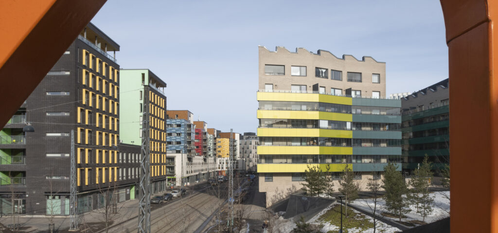
A red-distemper cottage sits calmly in the rural landscape, the gaudy-coloured facade panels of a new apartment building catch the eye on the city street, the rows of pastel-coloured houses along the riverside have been beautifully captured in a postcard, and brutal grey of concrete delights some while it angers others. The colours of the built environment evoke feelings within us, at least subconsciously, even if we don’t stop to think about the colour aspects.
The physical reality that surrounds each of us is colourful: almost all natural objects and parts of the built environment have their own characteristic colour. Colour is thus also an essential part of experiencing architecture. Architects play an important role in defining the aesthetics of the built environment. We can therefore ask why there is so little teaching and research on colour design in architecture. Architects encounter colour in their everyday work at the latest at the point when the building’s colour scheme is being drawn up, often in a hurry and relying on intuition.
Like other design solutions, the choice of colours should be able to stand the test of time. As designers, we cannot rely on momentary trends or personal preferences, but rather we should make choices that are both culturally and ecologically sustainable. Colour is not a surface decoration detached from the rest of the architecture, but intrinsic to the building’s materiality and an effective means of expression that can influence, for example, the pleasantness of the environment and the identity of the location.
Colour is not a surface decoration detached from the rest of the architecture, but intrinsic to the building’s materiality and an effective means of expression.
Over the last few years, in the three schools of architecture in Finland – the University of Oulu, Tampere University and Aalto University – the curriculums have included only a few courses dealing with colour. Most of these are art courses, where colour has been approached mainly through the colour theory of the visual arts, and not so much from the perspective of architecture. An exception has been Aalto University’s Colour – Light – Space course. Unfortunately, it has been decided that the popular course will be discontinued.
In courses on the history of architecture, colour is often included as part of the analysis of existing architecture, but this knowledge is rarely utilized in other courses. In building design courses, where it would be natural to discuss the relationship between architecture and colour, the latter is typically only a reference in the list of facade materials and illustrations. Most of the time, also architectural scale models are built entirely of white cardboard or of wood. This long-standing practice, both in education and in working life, implies that colour design is considered secondary in architecture. The scarcity of teaching on colour is also linked to the amount of academic research on this subject in Finland. There is very little scientific literature on colour design in architecture. However, interest in the subject has grown, especially among students.
Already at an early stage of their studies, architecture students learn about the meaning of place. We analyse a location’s lighting conditions, topography, the existing building stock and vegetation. A similar review should be made regarding colour: paying attention to the colours of nature and the human-built environment, and observing how they change at different times of the day and year.
Understanding the colour range of a place provides the designer with the opportunity to make colour choices that either stand out from the landscape or blend in as desired. Also, teaching the theoretical foundations of colour design, such as phenomena related to colour perception, colour strategies and systems, would increase the architect’s capacity to design a high-quality and sustainable living environment in terms of colour. With the eco-crisis, increasingly more attention must be paid to the ecology of building materials and colourants.
Perhaps architects in the future will learn to see colour as a part of holistic design already at the beginning of their studies, find a natural role for colour as part of their own identity as designers, and be able to justify their colour choices in a variety of ways. It is time to learn to think about the colour of our environment already at the sketching phase. ↙
The authors are architects who studied the relationship between architecture and colour in their recent Master’s theses.