Something Old, New and Borrowed – But Do We Have Anything Blue?

The urban planners working on Tampere’s new colour plan would be wise to look to earlier examples for guidance.
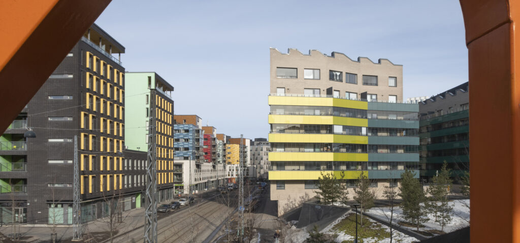
Last year, the City of Tampere published a new architectural programme, which proposes the ambitious goal of drawing up a colour plan for the city. This is a unique ambition, as there is only one previous example of a historical colour plan that has been published in Finland. Research on facade colour schemes is primarily associated with surveying the colour history of individual buildings with the aid of archive sources and an analysis of surface treatment layers. The studies are usually not extended to cover wider built areas, which means that there is no way of determining whether the colouring is typical of the area or how it relates to the surrounding cityscape.
In Europe, guidelines on the use of colour in historic urban areas began to be adopted on a wider scale in the 1980s, at a point when building conservation, in general, was extended to apply to larger urban areas. In the ICOMOS Charter for the Conservation of Historic Towns and Urban Areas (1987), the colouring of an area is defined as one of its characteristic qualities that should be preserved. The value of historical colour schemes was recognized after they had been lost with the advent of modern surface treatments and replaced by bright pastels across Europe. Traditional materials had offered a more restricted colour palette, thus creating a more cohesive urban landscape. Research in and guidance on repainting were sought by drawing up urban colour plans.
In Finland, urban colour plans were drawn up by building conservator Thorvald Lindqvist, who had previously worked at the Finnish Heritage Agency, where his official duties had included working as a colour designer for several government buildings. Specifically, Lindqvist drew up colour plans for Helsinki (1983) and Tampere (1989). Yes, Tampere’s first colour plan was, in fact, compiled 35 years ago, but it appears that it was subsequently buried in the archives of the building control authority and was never published, unlike the plan for Helsinki. Helsinki’s planning authorities have been utilizing and developing their colour plan ever since it was first completed. Today, the plan has been expanded into an online database.
New Plan, New Methods?
The concept of an urban colour plan is very wide and undefined. In the early days of urban colour planning, the research methods depended on the professional background of the researcher. In Italy, the colour plans by architect Giovanni Brino were rooted in archival research, whereas Norwegian conservators Jon Brænne and Tone Marie Olstad based their plans on materials research on surface treatment layers in order to identify pigments and binders.
Upon its completion, Thorvald Lindqvist’s Helsinki colour plan received criticism from the Finnish Heritage Agency, questioning the reliability of the research behind the colour schemes. What raised suspicion was that Lindqvist was seen more as an artist than a research-minded conservator. Some of the proposed colours, therefore, may have been selected based on Lindqvist’s views on the colours that suit a specific historical period and area, rather than actual colour layers discovered on the facades. Furthermore, Lindqvist did not extend his research to archival material.
What, then, should planners take into account in drawing up Tampere’s new colour plan in order to avoid the shortcomings of the Helsinki colour plan? Coming into the present, the requirement of transparency in the architectural paint research has become even more important. At the same time, research methods have expanded to include a diverse range of laboratory analyses. However, the aim in developing the methods has not been to survey the overall colouring of various areas, but to achieve a more in-depth analysis of specific buildings or projects. For any new methods to be utilized on the scale of a comprehensive urban colour plan, they need to be re-examined in this particular context, preferably as a collaboration by a multidisciplinary team.
Seeing as the architectural colours in Tampere have already been studied by Lindqvist, as well as several other colour researchers, the 2020s colour plan, unlike its predecessor, should begin with a thorough literature review. In the name of source criticism and transparency, the source material, i.e. survey reports, should be made publicly available. One option would be to implement the colour plan in the form of a regularly updated database into which all previously completed and future studies would be stored.

Colour Conservation
The introduction of a plan does not necessarily mean that the proposed colour schemes are actually observed when buildings are repainted. Tampere’s new architectural programme offers the solution of setting up detailed building guidelines, even in cases in which the local detailed plan is not being amended. There is one cautionary example of such a model in Tampere, however, in the district of Kaleva.
Kaleva is located in the eastern part of inner Tampere and represents one of Finland’s largest and most cohesive areas built during the post-war reconstruction era. In 2015, the City of Tampere published a report drawn up by Arkkitehtitoimisto Hanna Lyytinen and Arkkitehdit MY, which included a survey of the preservation status of the area’s original character, in addition to outlining building guidelines (so-called RTO guidelines) that were meant to ensure that the cohesiveness of the area would also be preserved in future renovations.
As regards facade colouring, the primary option recommended in the guidelines is to restore the building’s original colour by using original materials. If it is not possible to analyse the original colouring – for example, in cases where the old painted surface, i.e. a building component or rendering coat, has been removed – renovators should, nevertheless, adhere to the typical colouring of 1950s limewashed buildings, instructions for which are provided in the guidelines. However, the local detailed plans in the Kaleva district have not been amended since the publication of the report. In other words, the buildings were not listed for protection, which meant that the RTO guidelines were never made legally binding. The recommendations on limewash tones have not been observed in maintenance painting jobs undertaken after the RTO guidelines were published, and with new acrylates and silicone resin emulsion paints, the colours introduced to Kaleva have become brighter and more intense than ever before in the history of the district. Facade alterations have gone through the usual minor alterations or building permit process as per the City’s building ordinance, but this has not had the effect of maintaining a colour scheme in the district that would be representative of the period of construction, as was suggested in the RTO.
It remains to be seen whether Tampere’s new colour plan can actually change the views and goals of property owners when it comes to colouring. Helsinki’s colour plan has raised awareness of the city’s historic colour schemes and made them easily accessible online, but the current colouring of Helsinki’s historic areas is ultimately the result of more than 40 years of persistent cooperation between the building control authorities and the City Museum. Perhaps there is a lesson here to be learnt for Tampere. ↙
AAMU KOIVISTOINEN is architect and Bachelor of Culture and Arts (Restoration), who has worked at Arkkitehtitoimisto Hanna Lyytinen since 2017.


