Advert

Short Syllabus in Colour Research

The research-based colour design is weakly known in Finland. Colour researcher Saara Pyykkö shares her insights on what an architect should know about colour.
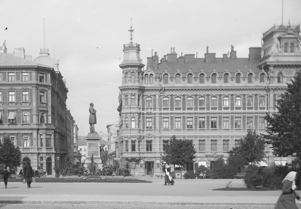
The previous issue of the Finnish Architectural Review dedicated to colour, 3/2010, explored a tentative reintroduction of colour into contemporary architecture. The volume included examinations of architectural layers of colour and presented articles about colour theories. Artist and colour researcher Harald Arnkil challenged the reader through the concept of chromophobia, coined by artist and author David Bachelor, and asked why Finnish architects are so afraid to use colour. Berlin-based architects Matthias Sauerbruch and Louisa Hutton were presented as the most well-known “colour architects” of the time. They initiated a trend in which the exterior colour scheme of a building consisted of a pixellated composition of sheeting that was finished in different colours. The 3/2010 issue also reflected on the role of the visual arts in infusing colour into architecture. Indeed, Finland has a long tradition of collaboration between architects and artists.
An interesting point from the perspective of research in colour design was expressed by Editor-in-Chief Jorma Mukala in describing the newly-found resurgence of colour in Finnish architecture. “The minimalistic greyness and monochrome starkness paired with the use of materials according to their true nature, so well adapted to our mental environment, are now paralleled by a vogue that favours bright colours. What message do these colourful buildings convey?” From the point of view of design research, this could be interpreted to mean that there were only four alternative positions to choose from in Finland as regards colour in architecture: the black–white–grey palette, the use of genuine materials, bright colours, or relying on art to bring colour to the design. Another intriguing perspective was apparent in the descriptions of the design practices themselves: the “use of colour” evidently referred to a liberal use of quite intense, highly saturated tones.
However, in our Nordic neighbours and in the International Colour Association (AIC) founded in 1967, the colour of architecture is a long-established field of research.The AIC Study Group on Environmental Colour Design recently celebrated its 40th anniversary. Another significant point is that the Natural Colour System (NCS), which is the standard in Sweden and Norway and also widely used in Finland, is based on the 1874 colour theory by Ewald Hering as well as a later Swedish colour perception studies.
In architecture, colour design is often designated as one of the most difficult areas of design. The reason behind this reserve is that colour design involves not only the colours and materials of a building but also the ways in which these will be perceived and experienced in varying circumstances. While the result of the colour design can be a list of colours and materials, it is not just a question of colouring. Architectural colour research is currently not as well utilized in design practice as it should be. In order to communicate a specific design strategy, we should first adopt clear and unambiguous terminology.

What Are We Talking About When We Talk About Colour?
In colloquial language, we can use the word “väri” (colour) as a synonym of hue (e.g. “the red wall”). However, the phenomenon of colour has three measurable properties: hue, darkness or lightness (i.e. value) and saturation (i.e. chroma). In addition, we might describe the “colour temperature”, i.e. the coldness or warmth of a colour, when, in fact, the felt temperature of a colour is a subjective experience. For instance, some might view different hues of blue as cold or warm, but when describing the quality of light, blue light is invariably perceived as cold and yellow light as warm.
We may also use the word colour when we are actually referring to pigments, colouring agents or the colour palette of a material, such as brick. Furthermore, we might define the nature of a colour through the mixing of surface colours, such as in the case of muted and tinted tones. In colour designing process, we talk about colour contrasts and compositions, in addition to connoting specific cultural contexts.
Colour design entails three common concepts that are somewhat problematic in terms of their ambiguity – namely bright, colourful and contrast. A “bright” colour is typically used to refer to an intense, highly saturated colour, sometimes even to a neon colour or a saturated primary or secondary colour. However, brightness is actually a concept related to the physics of light and describes the amount of reflected or radiated light. The word “colourful”, then, may be used to mean three different visual ideas. As a feature applied to a cityscape, it can refer to the use of any other tones besides black, grey, white and brown, or it can imply a variation of multiple different tones, or different and highly saturated tones.
Another common concept in design jargon is contrast. The problem is that it can mean either architectural contrasts (e.g. facade composition) or colour contrasts (e.g. hue, saturation). The most comprehensive glossary of colour terminology in Finnish can be found in the appendix to the book Värit havaintojen maailmassa (2008/2021) by Harald Arnkil (also published in English as Colours in the Visual World in 2013).
What Is Colour Design in Architecture?
Colour design can be carried out at varying design scales. Architectural colour design refers to the colour design of interior and/or exterior spaces or the facades of a building, whereas environmental colour design signifies colour or lighting design as applied to a block, facades and landscape design.
Colour design related to urban planning differs from the previous two in that it rarely entails the design of the final colours or materials of buildings. In urban planning, the colour design and instructions are steered by means of more abstract concepts, such as cityscape, architecture, identity and atmosphere.
Colour design also has very different implications when it comes to contemporary architecture or older buildings of historical value. The designer must be versed in the materials and finishes of architecture from different periods, but also be familiar with the significance of architectural history and culture, the source information and methods of colour design, as well as the interpretation thereof. Colour design for a valuable heritage building requires comprehensive archival, microscopic and material studies.

From Colour Perception to a Colour Experience
According to various sources, a person with normal colour vision can distinguish 5–10 million colours. For anyone who does not deal with colour in their everyday life, the range of identified colours is smaller and less nuanced. A person’s educational background, physiological characteristics and previous experiences of colour also impact their perception. Anomalies of colour vision are common – for instance, 5–8 percent of men have varying degrees of red-green colour blindness. Age is another factor affecting colour perception. The lens of the eye degenerates with time, and the world begins to appear slightly more yellow-tinted than in one’s youth, though our knowledge and experience of the colours in our environment tend to correct our perception.
Swedish colour researcher Ulf Klarén has defined three levels of experiencing colour. The first of these is categorical perception, i.e. the sensory perception of the colours, light, space, shading, contrasts and their interrelations in a specific situation. The second level, direct experience, describes our habitual ways of interpreting the aforementioned sensory information and, for example, its effect on how we experience materials. The third level is the indirect experience, which is influenced by cultural implications, history, traditions, scientific theories, trends, and art – in other words, by the entire cultural framework and all the knowhow that a specific person has acquired concerning colour and architecture. In the Finnish context, one might add to this third level the concept of cityscape, which informs the way in which we design, and steer the colours and materials of our built environment.
The Colour Experience in a Built Environment
Anyone who has engaged in colour design has come across a situation in which the colour of a finished project does not correspond to the colour sample. Karin Fridell Anter’s dissertation What colour is the red house? (2000) was conceived from an urge to study this exact phenomenon. A practical house painting guide, Färgen på huset (2001)by Karin Fridell Anter and Åke Svedmyr, was published based on her doctoral research, and the original Swedish book was also translated into Finnish (Mikä talolle väriksi? 2004). During her research, Fridell Anter carried out 3,600 colour observation experiments in Uppsala on wooden and plastered facades viewed from varying distances. She defined two concepts, the nominal colour and perceived colour. The nominal colour refers to a colour as measured in standard conditions, such as an NCS colour viewed in simulated daylight with a colour temperature of 5400 K, diffused through an opaline plastic sheet which gives approximately 1,000 lux. The perceived colour, then, is the colour as we perceive it in specific circumstances.
The implemented facade colour should typically be less chromatic in order for the perceived colour to correspond to the designer’s intended effect.
Fridell Anter’s research yielded three clear results that would make architectural colour design easier, if adopted into practice. First of all, she described the factors that influence the way in which the perceived colour is experienced. These include lighting, viewing distance, viewing angle, personal characteristics of the observer, size and shape of the viewed object, as well as gloss and surface structure. Secondly, she described the logic within the NCS system. The orange tone Y40R represents the culmination point in the NCS colour circle at which the hue starts to shift anticlockwise towards yellow, green or blue, while the hues clockwise from Y40R change towards red or blue. Another culmination point is between R70B and R80B. In the study, the perceived hues and values of different colours changed slightly differently, but as a rule, colours were mostly perceived as lighter and more chromatic when viewed from a greater distance. Applying the study results to practical design, therefore, the implemented facade colour should typically be less chromatic in order for the perceived colour to correspond to the designer’s intended effect. In addition, the designer needs to take into account the aforementioned logic behind the shifts in hue. Thirdly, Fridell Anter defined five basic landscape colour schemes: spring green, summer green, autumn brown, the winter brown of a yet snowless ground, and winter white. Although the landscape colours had little effect on the perceived colour in the study, they do describe the varying seasons, i.e. the environment in which the buildings exist.
In a built environment, colour is always also a temporal and spatial experience that changes with movement. Where Fridell Anter focussed on understanding the change in perceived colour, I have dedicated my own research to exploring the topic further from the point of view of the colour experience and colour design. In the Colour Walk method, professionals of colour and architecture walk through a residential area following a predetermined route, discussing their experience by using professional concepts. The most important factors influencing the colour experience are the materials, light and lighting, views into the area, from the area and within the area, as well as atmosphere and identity. Landscape, nature and landscape architecture constitute one indivisible entity. The concepts that are used to refer to colour in architecture itself can be divided into four categories – those having to do with urban or building design, as well as those related to colour trends and architectural history. On the scale of urban planning, colours may be linked to, for instance, the urban granularity, an area’s chromatic identity or the colours and materials of a public building and residential buildings. The colour design for a specific building, then, deals with the final designed colours of the building, such as the roof, balcony or details or the facade (colour) composition.

Strategies and Principles of Colour Design
Spanish architect and colour researcher Professor Juan Serra Lluch has defined three design strategies or specific methods with which colour can be associated with architecture and facades. The first strategy explains the habits, how colour interferes with the perception of the visual properties of architectural shapes (e.g. geometry, dimensions, visual weight and texture). It also defines to chromatic relationship between the building and its environment. The objective may be to merge, fade out and reconcile the building with its environment, or to highlight and make it stand out. Secondly, colour can be applied to describe the function or support the composition. The third strategy entails tools related to and facilitated by colour and colour design, such as the hue, colour contrasts, rhythm, composition, colour temperature and (colour-related) historical or cultural references. Indeed, colour design has its own intrinsic value that can only be realised through colour itself. In addition to Serra’s three strategies, the “use of genuine materials”, as mentioned by Jorma Mukala in the 2010 colour issue of the Finnish Architectural Review, represents another colour design strategy, namely that of the material-based colour palette, according to which building materials, such as brick and wood, have their own “authentic” colours, which can be complemented with white, black or, on occasion, an accent colour.
Serra’s colour design strategies can also be applied to urban planning, even though the design guidelines rarely specify the final colours of buildings. An urban designer outlines and defines the principles related to colour and material in cooperation with consultants. These include, for example, the way in which the colours and materials used in a new area connect to the surrounding environment and existing building stock. A new area can be divided into sections with their own colour-based identity. The plan may also inform the principles with which colour and materials tie in with a building mass or the materials used in the bottom or top floors.
As an example, a widely applied design concept in 21st century construction has been to set off the top two floors as a “box” or “parasite” with a smaller volume that is finished in a different material than the rest of the building. Another typical colour tenet in contemporary detailed planning is the “monochromatic monolith”. Here, the objective is to make the building into a monochromatic and solid, often brick-faced mass. One strategy is to adopt an art programme that applies a Percent for Art principle, such as has been done in the Kivistö district in Vantaa or in Tampere’s Vuores. Then, the final colours are based of the collaboration between an artist and an architect.
In addition to the aforementioned strategies, an urban designer defines the principles related to the colours and materials of buildings as regards blocks, facades, staircases, entrances, windows, doors, balconies or the colours and shapes of roofs. Here, the colour specifications are often determined from the point of view of the architectural design and the materials used (dark brick, light-coloured rendering) and not through the colours themselves.

The Trends of the Achromatic and Over Chromatic Palette
Our field tends to shy away from the word “trend” in the context of architectural periods, but its use is justified when talking about colour. Over the last 15 years or so, we have been living through two opposite eras when it comes to the use of colour – on the one hand, we have seen the rise of an achromatic (colourless) and, on the other, of a high or over chromatic (overly colourful) and polychromatic (multicoloured) age.
Colour in architecture does not come about in a void, and the spread of a number of new influences has been accelerated by the imagery, articles, blogs and postings on social media and online publications. According to Italian colour designer and theorist Clino Trini Castelli, the colours used in architecture, interior design, fashion, cars and other types of design are cyclic in nature. Renowned architects Rem Koolhaas and Zaha Hadid have claimed that working on computers, combined with our general visual environment, television and cinema, has also pushed the architectural colour palette towards the more intense spectrum, leading to an even “overstimulated” experience.
Not only are more and more new buildings grey, but previously non-grey buildings are also turning grey or white.
Two Norwegian colour researchers, interior designer, Assistant Professor Kine Angelo and Professor Alex Brooker, have also studied two opposite phenomena, achromatic and over chromatic colours, but especially the greying of Norwegian buildings. Not only are more and more new buildings grey, but previously non-grey buildings are also turning grey or white. There are several reasons for the greyness. Developers play a significant role, as they look for fast turnaround times and financial gains. Consumers are offered neutral tones that do not irritate people and are therefore easily saleable. The research has shown that Norwegian architects have also become mired in the idea of Scandinavian modernism. Furthermore, the architectural coating industry seeks profit through a limited colour selection; grey, white and black have been well-marketed and have thus gained popularity. In addition, the greige (grey + beige) trend in interior design of recent years has further perpetuated this phenomenon.
For the sake of curbing costs, it is not uncommon that the building materials are the de facto palette at the architect’s disposal. This is evident in the fact that, in the case of both colour trends of this century, the window frames are often grey (tones RR22 and RR23 in the RR colour chart) regardless of the overall colour scheme. In order to broaden the palette, architects might want to engage in a wider cooperation with the building industry also when it comes to colour.
Now, the two opposing cycles seem to be coming to a close. There are weak signals suggesting that something else is on the horizon. In interior and industrial design, for example, we have been seeing the emergence of postmodern pastels and soft rounded forms for some time now.

Possibilities of Colour Design
Many of the current challenges and changes affecting construction practices also involve colour and colour design. Dark brick buildings exacerbate the urban heat island effect – in densely-built urban areas, dark-coloured structures absorb heat in the summer, causing hot interior temperatures which can lead to adverse health effects. New facade panels and plastering techniques have made the highly saturated colours possible, but it can take a few years for the exterior surfaces to the fade because of UV radiation and humidity. In addition to ecological unsustainability, it is a matter of aesthetic unsustainability when a choice of colour leads to the use of a non-durable exterior material. Brick exteriors have been justified as being maintenance-free and sustainable.
The recycling of building materials is exceedingly creating a new type of aesthetics, which means that there should also be new colour research into the materials. As an example, a joint project by Ark-House Architects and brick manufacturer Wienerberger in the circular economy block under construction in Helsinki’s Jätkäsaari is pioneering the use of bricks made from recycled sanitary porcelain. Also, solar panels are now available in other colours besides black – in Spain, for instance, the panels installed in city centres are selected in the colour of the roof tiles.
Novel technology and aesthetics are also featured in Noora Yau’s and Konrad Klockars’ studies on cellulose-based structural colours and their application in design. Structural colours do not contain plastics or pigments, as the generous hues that shift and change with the angle from which the object is viewed come from the structure of the wood-based material, like the colours on the wings of a butterfly.
At present, more and more public buildings are being built from wood. Colour, however, remains an under-utilized design tool in Finnish wood architecture. This is apparent if we compare new wood construction in Sweden and Finland: our neighbours have been using colour in creating the mood of interior spaces, while in Finland, the standard design objective has typically been to create a “wood-coloured” space. The floor, walls and ceiling are often finished in pale wood. And if laminate flooring is used, the finish is also an imitation of a specific species of wood. Then the furniture and art are the only acceptable way to use colours in the space. Proper colour design would help to create meaningful places in schools and early childhood education centres and to make orientation in the spaces easier. In buildings for seniors, different contrasts should be applied in the floor, wall and ceiling colours to aid in the perception of the space. Colour design can also improve the pleasantness of the working environment in healthcare, for example, and even shorten the hospital stays of patients.
Everything Has a Colour
During the 1990s recession, the urban planner for Helsinki’s Pikku-Huopalahti district, Matti Visanti, stressed the significance of colour as a design tool that could be used to achieve variety within a tight financial framework. The colour palette of the district represented the architecture of its time, and some of the building materials have not stood the test of time, but Visanti’s message is, once again, relevant. Colour design has little effect on design or building costs, but it is highly impactful for the wellbeing and comfort of people.
In Oslo, for instance, the new colour guidelines are the most important concrete action taken in the city’s architectural policy in order to improve pleasantness for city residents and to create and maintain the chromatic identity of various city districts. The guidelines differ from the outmoded Helsinki colour plan (Helsingin värikaava), because they are based on knowledge of humans’ chromatic and spatial experience, not the abstract concept of cityscape.
Also, the guidelines are not a steering instrument bound to city planning or municipal building bylaws, but are rather meant as a guide to residents, housing companies, designers and decision makers.
Education in architectural colour design has a long history. In 1923, Johannes Itten published the Bauhaus curriculum wheel diagram, with colour as one of the six areas of basic competence, in addition to clay, stone, wood, glass, metal and textiles. Unlike the rest of the Nordic Countries, the three Finnish architecture schools do not currently offer any academic colour education, or closely related architectural and environmental lighting courses. One significant reason behind the current situation is that colour as an academic subject has been outsourced to field of fine art studies.
In 1925, at the first architectural colour conference in Berlin, Bruno Taut gave a presentation with the following advice to designers that is still valid today:
“Everything in the world must have a colour whatever it may be. All nature is coloured, even the grey of dust or soot, even the most gloomy and melancholy regions have a tonality that is specific to them. Everywhere light reaches, colour is a compulsory feature. The task of humankind consists in nothing more than giving form to vision, and to all things; but as soon as this is done, the most sinister creation is dressed out with a ray of sunlight. Since everything has its colour, all the forms created by humankind should also be coloured.” 1
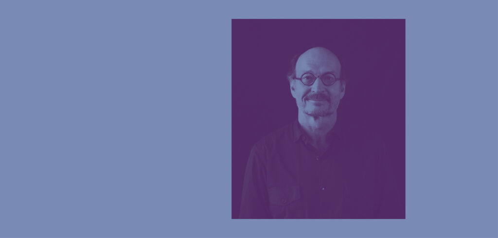
SAARA PYYKKÖ is finalising her doctoral research on colour design of new residential areas at Aalto University Department of Architecture. She is a colour researcher, colour designer and educator. She holds Master’s degrees both in Landscape Architecture (MSc) and Art Education (MA).
1 Winfried Brenne: “Réhabiliter l’architecture colorée de Bruno Taut”, Architecture d’Aujourd’hui 334, 2001, 46-51.
SOURCES
Kine Angelo & Alex Booker: ”S>C – Proposing a formula for Harmonic Urban Colour Composition”, Colour & Human Comfort, Proceedings of the International Colour Association (AIC) Conference 2018.
Alex Booker & Kine Angelo: ”Greying Norway: Influences and Drivers Examined Through a Discourse in the Popular Norwegian Press, Social Media, and Commercial Promotion”, Environmental Colour Design: Theory and Practice; Social Transformations (toim. V. M. Schindler & Y.A. Griber). Smolensk State University Press 2017.
José Luis Caivano: ”Research on Color in Architecture and Environmental Design: Brief History, Current Developments, and Possible Future”, Color Research and Application 31(4), 2006.
Clino Trini Castelli: ”Umbrella Diagram: 1981-2021, four decades of forecasts and CMF design”, Proceedings of the International Colour Association (AIC) Conference 2021.
Color research and application, Special Issue: Environmental Color Design 48(5), 2023.
Ulf Klarén: ”Physical Measurement and Human standars”. Kirjassa Colour and Light, Spatial Experience (toim. Karin Fridel Anter & Ulf Klarén). Routledge 2017.
Juan Serra Lluch: ”Three Color Strategies in Architectural Composition”, Color Research & Application 38(4), 2013.
Juan Serra Lluch: Color for Architects. Princeton Architectural Press 2019.
Saara Pyykkö: ”Conceptualizing the chromatic experience of environment: Two case studies using the Color Walk method”. Color Research & Application 48, 2023.
Saara Pyykkö: ”Oslon väriohjeistus on yhdistetty värisuunnittelun opas ja ohjekirja”. Rakennettu ympäristö 4/2023.
Saara Pyykkö: ”Uuden asuinalueen värisuunnittelu asemakaavassa. Väriohjeistuksen välineet ja värisuunnittelun periaatteet”, Yhdyskuntasuunnittelu 61(1), 2023.