A Harmonious Addition to the Meilahti Hospital Campus
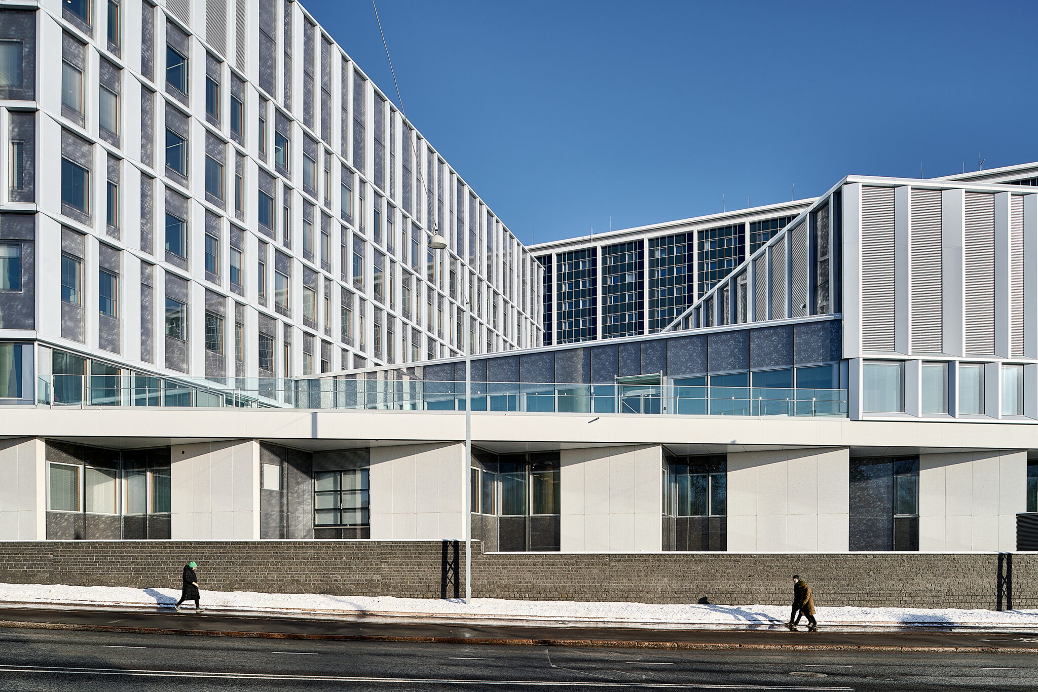
The latest addition to the Meilahti hospital campus has been fitted to a tight spot, yet it benefits from the stunning sea views.
From the outset, the brief for the new hospital building in Helsinki’s Meilahti district was far from straightforward. Intended to replace the no longer fit for purpose Töölö Hospital and cancer centre, it was to house an accident and emergency department, surgical and intensive care unit, phlebotomy and other sample collection facilities, department, outpatient clinic rooms and wards as well as teaching and lecture rooms, a restaurant, cafe and pharmacy. The new hospital would also need to link in with the Tower Hospital and Triangle Hospital buildings next door along with the existing cancer centre facilities scheduled for retention.
The site allocated for the project was a misshapen piece of land sandwiched between the existing buildings and streets. In financial terms, at almost €300 million, it would be the largest investment so far the Helsinki and Uusimaa Hospital District.
The client commissioned an invitation-only architectural competition to design the new hospital in 2015. AW2 Architects, B&M Architects, Harris-Kjisik Architects and Brunet Saunier Architecture joined forces to submit a joint bid, ultimately securing first place. Bridge Hospital derives its name from the skybridge that connects the two halves of the building.

HUS Bridge Hospital
AW2 Architects, Brunet Saunier Architecture, B&M Architects, Harris–Kjisik Architects
Location Haartmaninkatu 4, Helsinki
Gross Area 69 900 m2
Completion 2022
More photos and drawings of the project →
MATTI ANTTILA (AW2), JUSSI MUROLE (B&M) and HANNU LOUNA (Harris-Kjisik), how did you become Team Integrated?
Anttila: The reference requirements for the submission were so strict that we knew straight away a 100% Finnish team would struggle. One of the things they asked for was previous experience of university hospital A&E design. We already had a long track record of working with Brunet Saunier Architecture, actually in Meilahti itself funnily enough. And the three other Finnish practices we’d also worked with on various projects, so it all just fell into place really nicely.
Bridge Hospital is one of only a few recent hospitals built in Finland that were delivered through a competition. What impact did that have on the design process?
Louna: What the competition did was establish a clear brief for the project. Everyone had access to the big picture, if you will, of what the client was after as well as all the technical specifications, which made things easier at the point when specialist designers and sub-contractors came on board.
During the competition phase itself, the architects had several months to just let the brief, the functional requirements and the relationships between new and existing developments on the site to percolate. There was a lot to think about, so it was important to get your head down and work on some initial design ideas. It would have been much more difficult if more people and variables and time pressure had been involved from the start. As it was, by the time the project actually kicked off, we already had a pretty good idea of what we were dealing with.
Murole: With architecture competitions, juries always want to see potential for further development, but it was especially important to offer that with this one. What happened after the competition process had finished was that we pretty much started the design process over with the end users. We kept the essence but otherwise it was back to the drawing board. The local detailed plan obviously provided us with a very clear steer.
Louna: The local detailed plan was adopted in 2013. We had done the reference design at Harris-Kjisik. The massing and the location of the in-patient wards ended up being almost identical to what was set out in the detailed local plan.

How did you share the workload between the practices? Can you tell which practice has worked on which parts of the building?
Murole: For the competition we put together a team with representatives from all the different practices. We worked as one practice, all under the same roof. Everyone was happy to go with the best ideas, there was no professional jealousy. It was like we were able to tap into this hive mind.
What took me by surprise during the implementation phase was how intense the user-led design phase was. At one point, we had 80 future building users from lots of different departments working with us. At that point, we realised that we had to split into smaller groups. Because the users brought such different views and priorities to the table it was really challenging to bring it all together.
Anttila: But we still managed to work as one practice. The working group would come together regularly and the leadership team made sure that the work was delegated fairly. Once we’d put the team together, I don’t really remember being all that conscious about which practice people originally came from.
Murole: For practical reasons, the French team were more heavily involved during the schematic and strategic design phase. The closer we got to the detailed phase, the more focus there was on the Finnish setting, our regulatory environment and the specific needs of the Finnish users too. But we stayed in close contact with the team in France throughout.
What was it like working with the building users and other stakeholders?
Anttila: The collaborative approach worked extremely well from the beginning. In addition to the architects and the actual building users themselves, we were able to consult with the specialist designers if we had a query relating to an issue like ventilation or electrical services design. Alliancing can involve huge numbers of people and it often means that lots of ideas just get lost along the way.
Murole: When things were at their busiest, we would have four or five big room meetings a day, three days a week. The role of the architect was to be the curator and secretary.
Louna: Initially, the focus was on working with the building users on spatial allocations. Later on, we then turned our attention to specific individual spaces and equipment.
When it comes to designing a hospital, clinical needs, medical devices and hygiene considerations take priority. What sort of areas did you as the architects get to have a say over?
Anttila: The role of the architect is to bring together all the disparate elements that make up a project. The drawings we created acted as visual prompts for the stakeholders, and the big room meetings were an opportunity for us to invite reactions from them. These things are always a joint effort with the architect at the centre.
Murole: It’s also up to the architect to make sure that, from the outset, any draft designs reflect the technical specifications. Radiotherapy facilities, for example, must be built with 1 to 2 metre thick walls, and there is a minimum clearance that must be achieved for any metal objects. The new hospital adjoined existing buildings on the site which meant that the layout was already predetermined to some extent: new operating theatre capacity was built adjacent to existing operating theatres, radiotherapy facilities were extended and so on. In addition to these sorts of considerations, architects also work on massing and how the new scheme works in with the wider urban setting. Here, we had to ensure that the new scheme was a good fit with the historic setting.

Bridge Hospital is built on a confined site demarcated by public roadways and the historic Tower Hospital building designed by Jaakko Paatela and Reino Koivula in 1965. Given the spatial constraints, how did you manage to fit everything in?
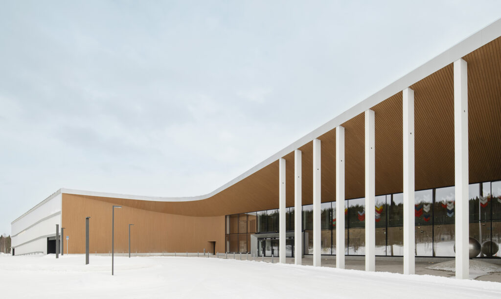
Murole: The detailed local plan had already looked at where the new hospital might best be sited to allow Tower Hospital to remain the landmark. Thanks to the breaks we added to the massing, Tower Hospital’s in-patient wards continue to offer wonderful sea views to the west towards Seurasaari Island. Preserving and benefiting from these views was our key priority throughout the process. The long Paciuksenkatu facade was another key task for us, and across on the other side of the site, we also had to make sure that the new building would be a complementary presence on Meilahti Square.
Louna: The materials we have used are designed to complement the existing campus. That said, I think that both the new tower housing the in-patient wards and the cancer centre have somewhat sculptural quality to them. These features do succeed in giving a sense of rhythm and definition to the almost 70,000 sqm building.
Beneath the skybridge, there is new access provision that connects Meilahti Square with Paciuksenkatu. We feel that this allows the hospital campus to integrate into the surrounding area.
Murole: The idea for the skybridge came to us during a lunch break in a bit of an a-ha moment. What we needed was for the two buildings to connect on two levels whilst still facilitating ambulance access underneath. The two levels are now connected via an auditorium staircase that can also be used for socialising.

Can architecture promote healing? And if yes, how does Bridge Hospital do that?
Murole: There are very precise technical and functional specifications that govern the design of clinical areas. When it comes to the patient experience, it’s important that corridors and foyers are comfortable and easy to navigate, and natural light is hugely significant. Outdoor areas matter too. This was quite a constrained site, so we added outdoor terraces where patients and their families can come and get some fresh air and look at the horizon.
Another way that we have tried to meet patient needs is by ensuring that it is the staff that travel to see the patient, not the other way around. The clinic rooms are built to a back office style layout which means that clinicians can exit them to a shared office space where they can do their admin and talk to colleagues. This feature was added to the floor plan after the competition had finished.
Louna: Architecture on its own cannot perhaps cure disease, but what we can do is help create a calm yet stimulating environment that will minimise stress for patients. To that end, this hospital has been built with a cafe as well as a staircase for socialising that patients can visit for a reminder of everyday life outside the hospital. In the lobby and waiting areas, wooden surfaces create a distinct atmosphere. The in-patient rooms also offer beautiful open views.
What did you find most rewarding about this project?
Anttila: Discovering how architectural design can help to deliver better care and improve health outcomes. When it comes to medicine, a lot of the latest advances have a functional and spatial element to them. I found it absolutely fascinating to be involved in designing some of the clinical processes, including the new Raptor suite for neurosurgical trauma patients. We also know that things like the distances between hospital units and seamless in-hospital transfers can have a real impact on outcomes.
Murole: This was the first hospital project our practice had ever worked on so I came to it completely fresh. We were lucky to have the users on board as we learned such a lot from them. What I find most rewarding about this project is that we have succeeded in delivering an excellent finished product that has made the users happy and the client proud. The feedback we’ve received definitely makes all the hard work worth it.
Louna: It was rewarding to be able to take part in the project in all stages and succeed in solving diverse design challenges. Impressively many experts from different fields and organisations were involved in making the hospital. And it has certainly been nice to receive positive feedback afterwards and to notice that the project has aroused interest! ↙

