The Yellow Library Remains

In the renovation of the Jyväskylä University Library, the uses of the building have been
completely reorganised, but the atmosphere conceived in the 1970s remains unchanged.
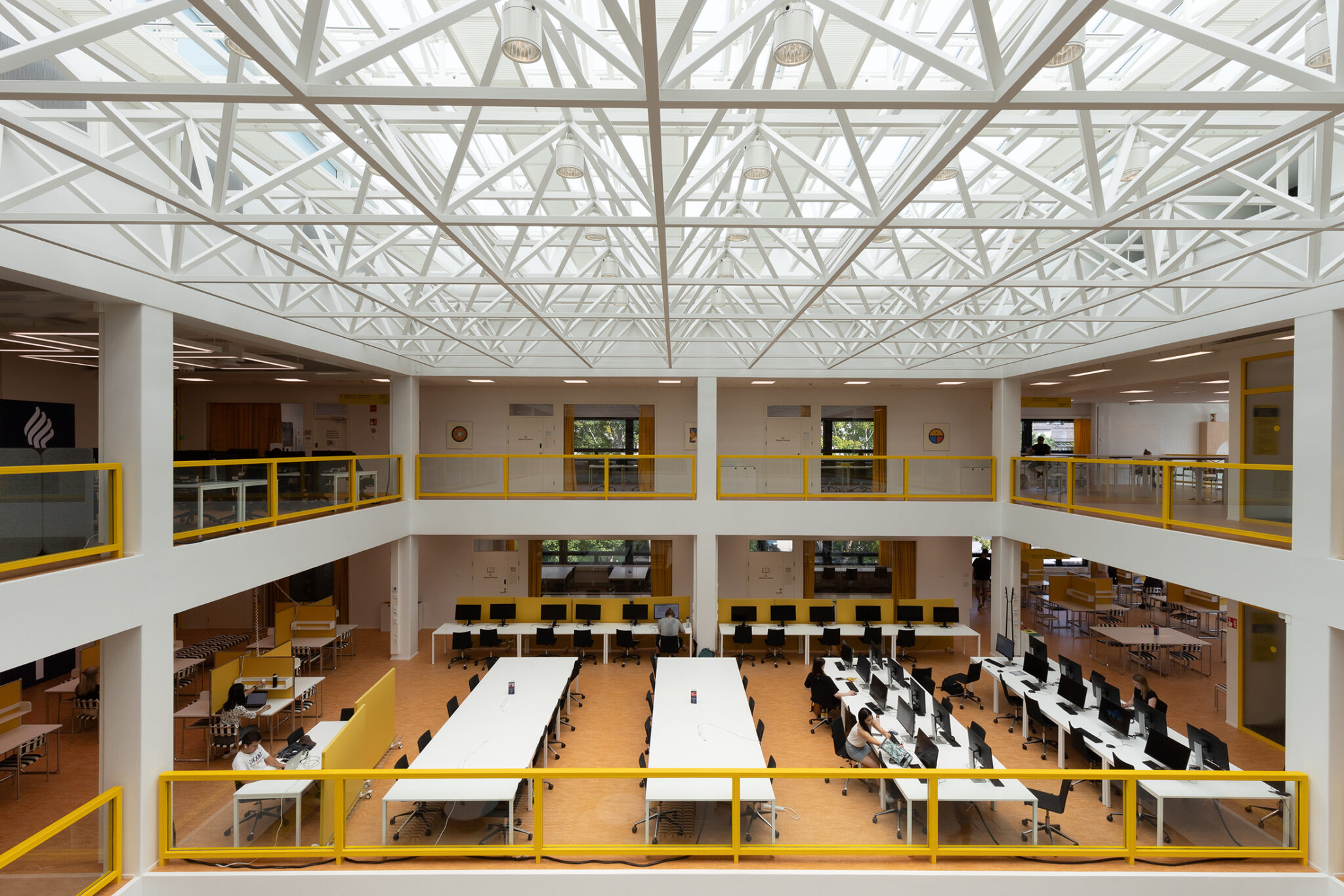
The University of Jyväskylä Library is best characterised by the colour yellow, and a cheerful and unabashedly retro atmosphere. The renovation of the library recently received the Finlandia Award for Architecture and the film director Klaus Härö, who chose the winner, also fell in love with the building’s compelling atmosphere. Particularly remarkable is that the library appears to have retained its authenticity, even though it underwent extensive spatial and functional changes during the renovation.
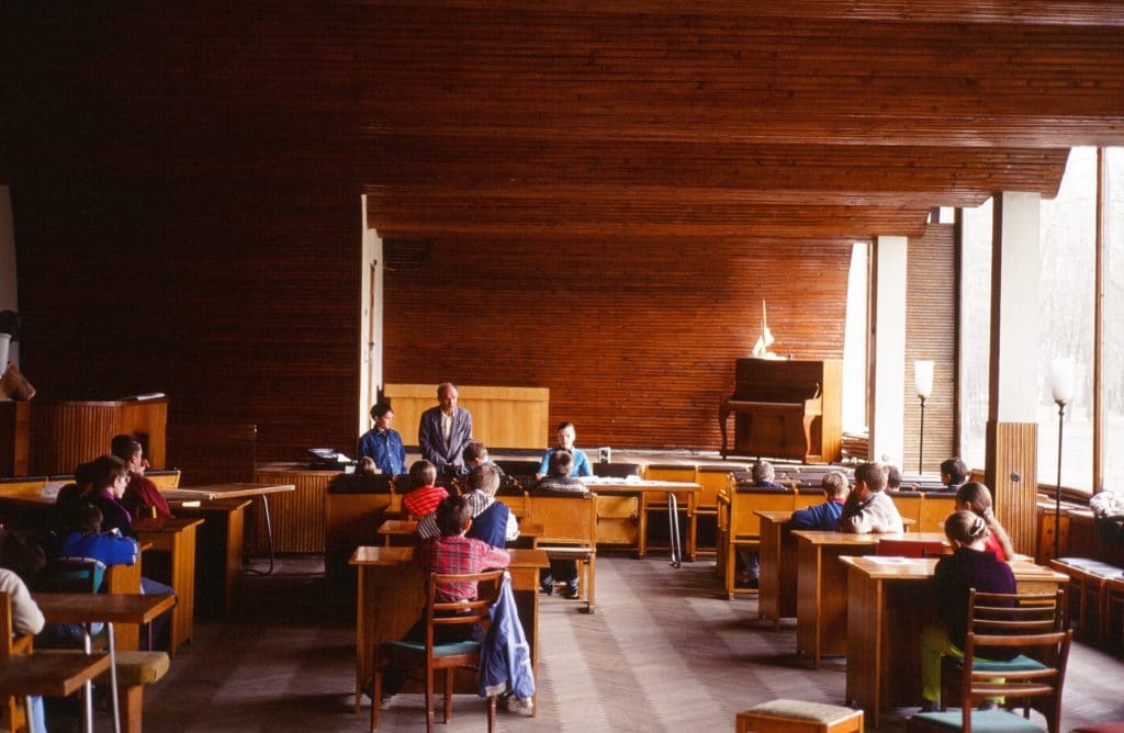
The University’s Seminaarinmäki campus has been built in several stages since the late 1870s, under several different architects. After Alvar Aalto’s contribution, Arto Sipinen (1936–2017) was selected in 1970 as the campus architect following on from a Nordic architecture competition. Sipinen designed a group of four buildings for Seminaarinmäki in the mid-1970s, as well as new university campuses in the districts of Mattilanniemi in the 1980s and Ylistönrinne during the following decade. During this time, Sipinen’s office achieved success in other competitions too, and consequently a large number of cultural buildings and municipal halls by Sipinen, recognisable for their distinct architecture, were built in different parts of Finland.
Because of their brick facades and appropriate scale, Sipinen’s buildings in the Seminaarinmäki campus relate artfully to the earlier building strata, even though the blue metal structures and strong modularity of the facades were a contemporary theme in line with the ideas of the Structuralist movement in architecture. On the other hand, even the blue colour refers to the hues of the eaves decorations of the neighbouring buildings designed by Konstantin Kiseleff.

Jyväskylä University Library Renovation
Sipinen Architects / Ari Sipinen (principal and architectural design)
BST Architects / Merja Kiviranta (architectural design of interior spaces)
Location Seminaarinkatu 15, Jyväskylä
Gross area 11 274 m2
Completion 2021
Old building Arto Sipinen 1974 (Arkkitehti 1/1975)
More photos and drawings of the project →
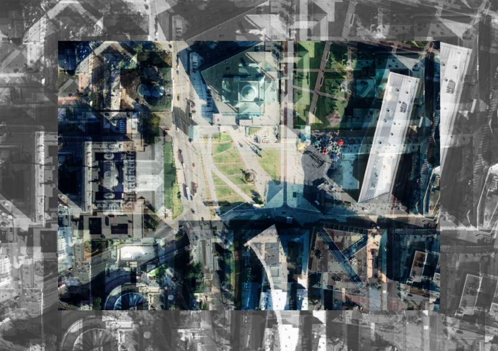
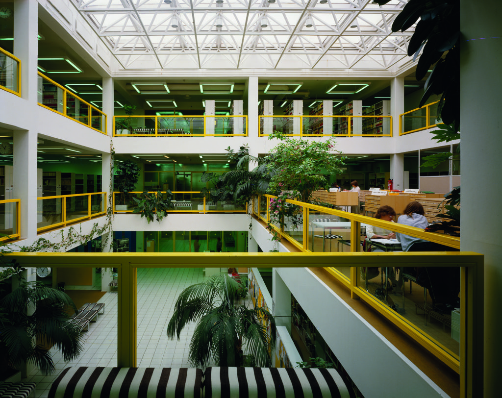
The location of the science library, which was completed in 1974, is particularly meaningful in the cityscape: it is at this point that the grid plan that dominates the city centre ends and the urban expression changes to the park-like landscape of the campus. The library offers views of both the verdant campus and Lake Jyväsjärvi. These views together with the three-storey atrium space and skylights are among the library’s central design themes.
The strong yellow colouring of the building, which at one time was named the largest scientific library in the Nordic countries, was determined by the curtains, the metal doors and balustrade structure, as well as the fitted carpets, which were removed in the early 1980s. The fixed and non-fixed furniture designed by Vuokko and Torsten Laakso was mainly in white, while the upholstery fabric was black and white striped, as a counterbalance to the multi-coloured books. The dynamic patterned fabrics, called “Jyväskylä summer”, were made specially for the building.
Following in his father’s footsteps, architect Ari Sipinen became the principal designer of the recent renovation, completed in 2021. In the renovation, the exterior of the building remained mostly unchanged, but the book storages were moved away from the campus; an increasing amount of the material is digital and it was felt that the large reading rooms were too large. Students needed different types of adaptable workspaces and rooms for small groups.
Sipinen says that the work, which ended up taking more than four years from project planning to implementation, was memorable and inspiring in many ways. The Finnish Heritage Agency closely supervised the planning, and compromises were developed in a positive spirit of cooperation. Sipinen also emphasises the role of architect Merja Kiviranta of BST Architects in the initial material requirements and project planning, which included numerous user meetings. All this created an excellent starting point for the further planning. Kiviranta also prepared the interior design plans, in accordance with which a commendable amount of Laakso’s black and white furniture has been renovated. Next to these have been built bright yellow shelves, in keeping with the spirit of the 1970s, which further emphasises the yellow theme that dominates the interior.
The main door was initially accessed via a ramp and stairs sheltered by an arcade. These were preserved in the renovation, but new stairs were also added in front of the entrance, directly facing the main doors. In this way, a new public square was created in front of the building. At the same time, the arcade’s importance in signifying the direction of the traffic routes was lessened. The facades, with their metal windows, were completely rebuilt, and the wall thickness and the dimensions of the blue pillars were increased slightly. The building’s interior had been infamous for its exceedingly high temperatures on hot summer days, to which the new facade and window structures as well as the ventilation provided a solution. As a result of renewing the HVAC infrastructure, the machine room on the roof was raised in height by a significant amount, as much as 1.25 metres.
The conversion flexibility of the building based on a pillar-and-beam structure was fully utilised when the interior functions were almost completely rearranged. The reading rooms and bookshelves on the upper floors, with their favourable views of the lush campus, were converted into open offices of various sizes. When the library was designed in the 1970s, the plan was to be able to expand into the adjacent administrative building, but the opposite happened. The space on the ground floor, which was originally a reading room, is now a canteen. The café had already moved from the first floor to the ground floor in 1993. These spaces received new large windows in the southwest facade in accordance with the original design principles.

New spaces have been cleared in the basement floors for the students’ reading and workspaces, which used to be where the offices are now. Even those spaces that are accessible to students on the upper floors hardly have any views overlooking the campus. Largish stairwells have been opened in the floor structure in the ground floor lobby, leading to the two lowest floors that were previously used as book storage spaces. The importance of the library as a community space for students is still obvious. After the initial corona years, the library has been busily filled with activities, and the spaces surrounding the atrium even create an overcrowded impression next to the silence of the offices.
The open space, covered with what was in its time a state-of-the art space grid, is still the focus of the building’s interior – even more strongly than previously. In addition to the passageways, the new intermediate floor openings have created interesting oblique views. The appearance of the new basement spaces is adapted to the spirit of the rest of the building, and even the stair railings of the new openings are similar to those on the upper floors. It is as if the design continued the original process, conscientiously using its principles, solutions and details. But should some kind of recognisable difference have been made in the new parts, giving a hint to the perceptive visitor about a new layer?
The library’s spatial changes have been fundamental and clearly larger than they seem at first glance. Elevating the original idea of Structuralist architecture and flexibility as the premise for the guidelines of the renovation and preservation, instead of preserving materials and the spatial layout, has produced a cohesive and original-looking building. However, its material authenticity is quite low. The library is sort of a contemporary stylistic restoration. ↙
JONAS MALMBERG
Architect, MA. Works at Alvar Aalto Foundation on questions related to the protection and restoration of modern architecture.


