Published in 5/2020 - Monument
Filling in the Blank

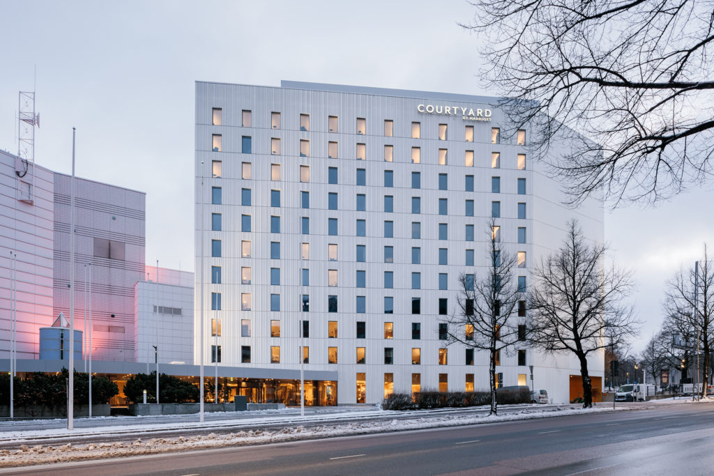
A brand new Courtyard Tampere City Hotel, designed by ALA Architects, seeks to foster a sense of cohesion between Tampere Hall and Tampere University’s main building.
Architects JUHO GRÖNHOLM, ANTTI NOUSJOKI and SAMULI WOOLSTON, how did you come to design a new Marriott hotel for Tampere?
The City of Tampere organised a competitive tendering process to identify a hotel operator, developer and designer for the project. We started by putting our own team together and managed to get SRV and Marriott on board too. The project is pretty close to our hearts in the sense that the initial impetus for it came from us. In the end, there were three bidders for the contract.

ALA Architects / Juho Grönholm, Antti Nousjoki, Samuli Woolston
Location Yliopistonkatu 57, Tampere
Gross area 9 523 m2
Completion 2020
Old building Tampere-talo, Esa Piironen & Sakari Aartelo, 1990 (ARK 8/1990)
More photos and drawings of the project →
The hotel you’ve designed is located right next to the Tampere Hall congress and concert venue. Designed by Sakari Aartelo and Esa Piironen in 1990, it’s been extended on a few occasions and definitely counts as a local architectural monument. What’s your take on it?
The interesting thing is that, for such a large building, it doesn’t have a loud or aggressive presence in any way. It’s perhaps a bit dated; you don’t see this approach where buildings are split into lots of smaller elements and constituent parts very much anymore.
As far as the sort of monumental aspect of the building goes, the interiors have been created on this lovely human scale. There’s always lots going on in the promenade, with the concert hall, the conference centre, the Moomin Museum and the subsequent extensions but you never feel overwhelmed when you’re there. All in all, one might say it’s a fantastic example of mini-monumentalism.
“The hotel doesn’t draw attention to itself.”
In your view, what does the hotel bring to the mix?
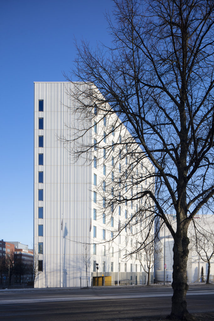
What we set out to achieve was a pared down, straightforward design on a fairly large scale. We wanted it to not look like an extension to Tampere Hall but we also wanted to avoid creating an overly stark contrast between the two. The idea is that the oblique lines that define both the building’s facade and form create a cohesive effect with Tampere Hall but also link the design with the university buildings across the road.
Tampere Hall is an interesting addition to the urban setting here because it is set back from the street and only the front edge of the canopy structure makes contact with street. The front of the building faces towards Sorsapuisto Park, while the rear, complete with delivery entrance and backyard, faces towards a busy street. The building’s most featureless aspect, the back of the auditorium, is also its most prominent one. The section of the site facing the street is so generous in scale that it retains this quite spacious feel even after we added a reasonably sized hotel to it. The site was there, practically waiting to be developed. The university building across the road has a lot of similarities with Tampere Hall. It presents this fairly blank and featureless facade towards the street. There’s quite an amount of distance between the two buildings and very little engagement between them. We thought very carefully about what we could do to lend a more urban feel to the junction, to generate a bit of energy here.
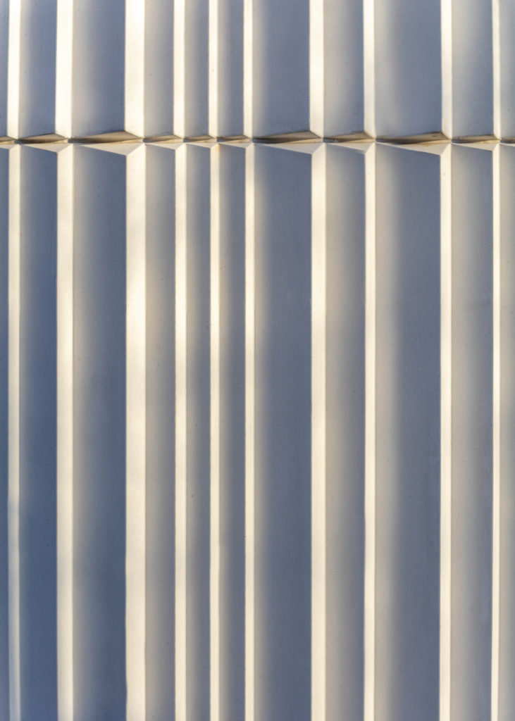
The hotel exterior now takes its cue from the white concrete elements used on the university building. In this project, the materials are inspired by the context.

Did you create the grooved concrete elements especially for this
project?
Yes. We’ve built up a reputation for unique architecture, but this is probably our least unique building to date – a hotel for the world’s biggest hotel chain and brand. It’s been a really welcome change from our usual practice. The more disciplined approach also entailed a really tight focus on the financials. We decided to take that as a positive and treated it as a challenge to not add anything unnecessary or superfluous to the design. The structure is built using traditional sandwich panels.
From the very beginning of our careers, we’ve always really enjoyed working with concrete. Kilden Concert Hall in Norway features vast expanses of fibre-reinforced concrete. Since that project, we’ve gone on to use three-dimensional concrete on the facade for Kuopio City Theatre. I guess you could say that the Marriott is like a super ordinary take on traditional Finnish concrete construction. Except we knew that there are people who really know their way around concrete in Finland, and we managed to get up to 15 centimetres of variation on the profiling. Concrete is not exactly a luxury material, but you can shape it to create really amazing finishes. The essence of architecture is to take something ordinary and make it extraordinary. And here we’ve really succeeded in making that happen, if you’ll permit us to toot our own horn. We’ve managed to create fantastic quality here by taking a really simple material and putting some serious effort into it.
“The hotel has been a really welcome change from our usual practice.”
What sort of planning constraints and client brief were you working with?
When it came to the exterior, Marriott left it completely up to us. In fact, they didn’t even want to see what we had planned. The company don’t actually manage this particular hotel themselves, they’ve franchised it to an external operator.
The city council, on the other hand, were very engaged with the visual aspect and we had some fairly robust exchanges with them before building permit was granted. I think they were a bit put off by the thought of concrete facade. It might be that they didn’t trust that we’d actually deliver what we were promising.

Chain hotel interiors usually follow a fairly strict design concept.
What involvement did you have with the interiors?
Room programme as well as the interior surfaces, colours and materials are all based on Marriott’s precise in-house concept. It was specified that the hotel had to link in with the wider Tampere Hall. It was up to us as the architects to make sure that the elements connecting the two buildings worked well.
Hotels these days are set up to run incredibly efficiently with very few staff. The public area on the ground floor serves as a breakfast room, bar, cafe and restaurant depending on what time of day it is. We’ve tried to make it as light and spacious as the Tampere Hall lobby and to retain the same sense of connection with the outdoors. We’ve adapted and localised some of the standard Marriott interior design elements and tried to make sure that the decor is a good and natural fit with the building. Downstairs, for example, we’ve left the concrete columns exposed so people can see what the structure is made of, we’ve just tidied them up bit.
Now that the hotel is finished, what do you think you’ve done
particularly well?
The fact that the hotel doesn’t draw attention to itself. It’s big but it also works really well where it is. It’s a stylish and measured addition to the site and complements both Tampere Hall and the university. It feels like that part of town is done now, everything’s in place. The centre of Tampere has undergone huge infill development in recent years, and there’s still more to come. This project is an excellent example of how that kind of transformative development can be done well. ↙